TL;DR
- Firecrawl: web context APIs for collecting live web data as clean Markdown or structured JSON, with Search, Scrape, Crawl, Map, and Interact in one stack.
- NumPy and Pandas: the core pair for fast numerical computation, tabular data wrangling, and exploratory data analysis. For large datasets, Polars is a Rust-powered alternative worth knowing.
- SQLAlchemy: connects Python to any SQL database so you can run complex aggregations at the database level before data hits memory. DuckDB handles the same for local CSV and Parquet files.
- Matplotlib, Seaborn, and Plotly: a full visualization stack: Matplotlib for full chart control, Seaborn for quick statistical visuals, Plotly for interactive charts you can share or embed.
- Scikit-learn and PyTorch: cover the full ML spectrum, from regression and classification pipelines to deep learning and transfer learning for images and time series.
- Streamlit: turns a Python script into a shareable interactive dashboard in minutes, no front-end skills needed.
Data analysis sits at the heart of modern data science work. As a data analyst, your work involves acquiring data, building data pipelines, cleaning and transforming datasets, performing exploratory data analysis, and creating compelling visualizations. The final step often includes generating reports or interactive dashboards that help businesses make informed decisions.
Python has become the go-to language for data analytics because of its versatility and the vast ecosystem of open-source libraries. These Python libraries for data science enable everything from connecting to SQL databases and cleaning large datasets to building machine learning models and visual dashboards.
In this blog, we will explore eleven Python libraries for data science that every analyst should know. These libraries are grouped into five key categories:
- Data extraction
- Data analysis
- Data visualization
- Machine learning
- Interactive dashboards
Each library includes an introduction, a practical use case, and a short code example, so you will not only understand what it does but also how to use it effectively in real-world scenarios.
Data extraction Python tools
Data analysts often need to find or extract data from the web, so learning web scraping tools and libraries is essential. In this section, we will explore an AI-powered web data extraction tool and a Python library for downloading public Kaggle data, giving us fast access to real-world datasets for analysis.
1. Firecrawl
Firecrawl is the context API to search, scrape, and interact with the web at scale, trusted by more than 1 million developers and a top-100 GitHub repository. It covers the full web data workflow: Search finds fresh sources from the live web, Scrape turns any URL into clean Markdown or structured JSON, Crawl extracts content across an entire site, Map discovers site structure, and Interact handles clicks, forms, logins, and dynamic pages a standard scrape cannot reach. Outputs are clean and token-efficient, ready to plug directly into your analysis pipelines and dashboards.
Firecrawl use case:
- Market and competitive intelligence: collect product pages, pricing tables, and feature lists from competitor sites for competitor analysis and side-by-side benchmarking.
- Review and sentiment mining: gather user reviews and testimonials for sentiment analysis and topic modeling.
- News and PR tracking: monitor newsroom/press pages for announcements.
- Dataset creation: convert web pages into structured datasets (JSON) for model training and evaluation.
- ETL for BI: schedule web scraping automation pipelines, normalize into tabular form, and load to your data warehouse for reporting.
For ongoing collection, Firecrawl's Monitor runs recurring scrapes and crawls on a schedule and notifies you via webhook or email when page content changes. This makes it straightforward to keep competitor pricing, news feeds, or any live dataset automatically up to date without manual re-runs.
Firecrawl code example:
In the example below, we will use the Firecrawl Python SDK to extract the latest blog posts from my blog, abid.work.
- To get started, create a free Firecrawl account, generate an API key, save it as the environment variable
FIRECRAWL_API_KEY. - Install the Firecrawl Python SDK by running
pip install firecrawl-py. - Initialize the Firecrawl client using the API key.
- We will use the
scrapeAPI to extract only the latest post section from the page. - In the
formatsargument, we have specified that we want the output in JSON format and provided a prompt to guide the web scraper to return the latest posts from the page.
# pip install firecrawl-py
from firecrawl import Firecrawl
import os

app = Firecrawl(api_key=os.environ["FIRECRAWL_API_KEY"])

result = app.scrape(
    'https://abid.work/',
    formats=[{
      "type": "json",
      "prompt": "Extract the latest posts from the page."
    }],
    only_main_content=False,
    timeout=120000
)

print(result.json)
As we can see, we received the results in JSON format. It includes a list of the latest blogs, but the dates are incorrect. The best part is that it has gone through each post and generated an AI-generated summary of the content, which is currently being analyzed.
{'posts': [{'title': '12 Essential Lessons for Building AI Agents', 'author': 'Abid', 'date': '2023-10-01', 'content': 'This post discusses essential lessons for building AI agents, focusing on practical insights and strategies.', 'url': 'https://www.kdnuggets.com/12-essential-lessons-for-building-ai-agents'}, {'title': '5 Free AI Courses from Hugging Face', 'author': 'Abid', 'date': '2023-10-01', 'content': 'A roundup of five free AI courses offered by Hugging Face, aimed at enhancing your AI skills.', 'url': 'https://www.kdnuggets.com/5-free-ai-courses-from-hugging-face'}, {'title': 'Top 7 AI Web Scraping Tools', 'author': 'Abid', 'date': '2023-10-01', 'content': 'An overview of the top seven AI web scraping tools available today, including their features and use cases.', 'url': 'https://www.kdnuggets.com/top-7-ai-web-scraping-tools'}]}2. KaggleHub
KaggleHub is a Python library that provides data analysts with a fast and reliable way to access Kaggle datasets, models, and notebook outputs directly within their analysis environment. This tool simplifies the day-to-day tasks of a data analyst, such as ingesting data, exploring trends, and producing summaries that are ready for key performance indicators (KPIs) using trusted public datasets.
KaggleHub use case:
- Instant access to public datasets: Quickly import datasets from Kaggle directly into your Jupyter or Colab notebooks using the kagglehub API.
- Version-controlled dataset management: Keep datasets in sync with Kaggle's latest versions without re-downloading entire files.
- Streamlined ML model training pipelines: Automate dataset fetching as part of your machine learning pipeline or CI/CD setup.
- Rapid prototyping and benchmarking: Pull benchmark datasets (like Titanic, MNIST, or House Prices) to test new ML models or compare algorithms.
- Collaborative research and reproducibility: Teams can use shared Kaggle datasets across multiple environments (local, Colab, cloud) with a single API key.
KaggleHub code example:
In this Python KaggleHub tutorial, we'll download a medical insurance dataset, load it into a Jupyter Notebook using the KaggleHub API, and display the top 5 rows.
kagglehub.dataset_download()automatically fetches and caches the dataset locally.KaggleDatasetAdapter.PANDASloads the dataset directly as a pandas DataFrame.
Note: For public datasets, you don't need an API key. Simply install the KaggleHub Python package with: pip install kagglehub
# pip install kagglehub
import kagglehub
from kagglehub import KaggleDatasetAdapter
import os

# Download dataset (cached locally)
dataset_path = kagglehub.dataset_download("mosapabdelghany/medical-insurance-cost-dataset")
print("Downloaded:", dataset_path)

# Load the CSV into pandas
df = kagglehub.dataset_load(
    KaggleDatasetAdapter.PANDAS,
    "mosapabdelghany/medical-insurance-cost-dataset",
    "insurance.csv",
)

df.head()
Output:
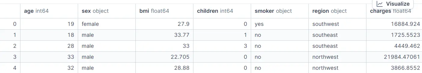
We'll now be using this dataset for the rest of the examples, as it is a simple generative data set that can be used for the model of the examples.
Data analysis Python tools
Data analysis tools allow us to load data and perform statistical analysis, while providing tools for data manipulation and visualization. In this section, we'll learn about fast array computation, data manipulation and analytics, and SQL data analysis tools.
Why use SQL?
Most structured data resides in databases. SQL enables us to filter, join, aggregate, and analyze data, all using a single SQL query. Together, these tools transform raw data into clear, actionable insights.
3. NumPy
NumPy is a fundamental Python library for data analysts. It offers efficient, memory-optimized n-dimensional arrays and supports fast, vectorized mathematical operations, making it much more effective than traditional Python lists for numerical computations.
With NumPy, analysts can easily conduct exploratory data analysis (EDA), calculate key performance indicators (KPIs) and performance metrics, and perform data segmentation or feature engineering with just a few lines of code. Its compatibility with other popular libraries, such as Pandas, Matplotlib, and Scikit-learn, makes it a solid addition to any data analysis or machine learning workflow.
NumPy use case:
- Fast numerical computations: Perform large-scale mathematical operations efficiently using NumPy's vectorized array operations, ideal for KPI analysis and statistical summaries.
- Rapid EDA and KPI checks: Compute descriptive statistics, correlations, and distribution summaries quickly to understand data patterns at a glance.
- Data cleaning and preparation: Cast data types, handle missing values, and normalize or scale numeric fields before modeling or visualization.
- Feature engineering: Create new variables, transform existing features, and prepare structured numerical inputs for machine learning models.
- Matrix and linear algebra operations: Solve linear equations, perform matrix decompositions, and execute mathematical transformations that power ML and statistical algorithms.
NumPy code example:
In this example, we will load the Medical Insurance Cost dataset, which was previously downloaded from KaggleHub, using NumPy's genfromtxt function. We will then conduct several common analytical tasks, including computing basic statistics, segmenting data with boolean masks, normalizing values, finding correlations, and comparing groups (specifically, smokers versus non-smokers).
#pip install numpy
import numpy as np

data = np.genfromtxt(
    f"{dataset_path}/insurance.csv",
    delimiter=",",
    names=True,
    dtype=None,
    encoding="utf-8"
)

# Access by column name
ages = data["age"].astype(float)
bmi = data["bmi"].astype(float)
children = data["children"].astype(int)
smoker = data["smoker"]              # "yes"/"no"
charges = data["charges"].astype(float)

# === NumPy Examples ===

# 1. Basic stats
print("Average age:", np.mean(ages))
print("Max BMI:", np.max(bmi))
print("Min Charges:", np.min(charges))

# 2. Boolean masking
high_charges = charges[charges > 30000]
print("Number of people with charges > 30,000:", high_charges.shape[0])

# 3. Vectorized operation (normalize BMI)
bmi_normalized = (bmi - np.mean(bmi)) / np.std(bmi)
print("First 5 normalized BMI values:", bmi_normalized[:5])

# 4. Correlation (Age vs. Charges)
corr_age_charges = np.corrcoef(ages, charges)[0, 1]
print("Correlation between age and charges:", corr_age_charges)

# 5. Group comparison: smokers vs non-smokers
smoker_mask = smoker == "yes"
avg_charges_smokers = np.mean(charges[smoker_mask])
avg_charges_nonsmokers = np.mean(charges[~smoker_mask])
print("Avg charges (smokers):", avg_charges_smokers)
print("Avg charges (non-smokers):", avg_charges_nonsmokers)
Output:
Average age: 39.20702541106129
Max BMI: 53.13
Min Charges: 1121.8739
Number of people with charges > 30,000: 162
First 5 normalized BMI values: [-0.45332     0.5096211   0.38330685 -1.30553108 -0.29255641]
Correlation between age and charges: 0.2990081933306476
Avg charges (smokers): 32050.23183153284
Avg charges (non-smokers): 8434.268297856204
When you need deeper statistics: NumPy handles fast array math, but for hypothesis testing, t-tests, and fitting probability distributions, SciPy builds directly on top of it. If your analysis involves comparing group distributions or running significance tests, scipy.stats is the natural next step.
4. Pandas
Pandas is the go-to Python library for tabular data. It offers DataFrame and Series objects that enable powerful and chainable data wrangling. This includes fast input/output operations for formats like CSV and Parquet, as well as exploratory data analysis (EDA), group-by operations, joins, reshaping, and time-series processing. Its seamless integration with NumPy, Matplotlib, and Scikit-learn makes it a fundamental component of any analytics or machine learning workflow.
Pandas use cases:
- Fast I/O & schema handling: Read/write CSV, Parquet, Excel; infer dtypes and validate columns quickly.
- Rapid EDA:
.head(),.info(),.describe(), correlations, value counts for quick data profiling. - Cleaning & preparation: Type casting, trimming/standardizing text, missing-value handling, outlier rules.
- Feature engineering: Binning, ratios, rolling stats, datetime extraction, categorical encoding.
- Grouping & aggregation:
groupby,agg,pivot_tablefor KPIs across segments and cohorts.
Pandas code example:
In this Python Pandas tutorial, we will load the Medical Insurance Cost dataset (previously downloaded via KaggleHub), run a quick EDA, clean text fields, engineer a BMI category feature, and compute average charges by region × smoker.
# pip install pandas
import pandas as pd
import numpy as np

df = pd.read_csv(f"{dataset_path}/insurance.csv")

# 2) Quick EDA
print("\nSummary (numeric):")
print(df.describe())   # works on all versions

# 3) A few simple manipulations

# Normalize text columns
df["sex"] = df["sex"].str.lower().str.strip()
df["smoker"] = df["smoker"].str.lower().str.strip()
df["region"] = df["region"].str.lower().str.strip()

# Add a BMI category
df["bmi_category"] = pd.cut(
    df["bmi"],
    bins=[0, 18.5, 25, 30, np.inf],
    labels=["underweight", "normal", "overweight", "obese"]
)

# Average charges by region and smoker
avg_charges = (
    df.groupby(["region", "smoker"], as_index=False)["charges"]
      .mean()
      .rename(columns={"charges": "avg_charges"})
      .sort_values(["region", "smoker"])
)
print("\nAverage charges by region × smoker:")
print(avg_charges)
Output:
Summary (numeric):
               age          bmi     children       charges
count  1338.000000  1338.000000  1338.000000   1338.000000
mean     39.207025    30.663397     1.094918  13270.422265
std      14.049960     6.098187     1.205493  12110.011237
min      18.000000    15.960000     0.000000   1121.873900
25%      27.000000    26.296250     0.000000   4740.287150
50%      39.000000    30.400000     1.000000   9382.033000
75%      51.000000    34.693750     2.000000  16639.912515
max      64.000000    53.130000     5.000000  63770.428010

Average charges by region × smoker:
      region smoker   avg_charges
0  northeast     no   9165.531672
1  northeast    yes  29673.536473
2  northwest     no   8556.463715
3  northwest    yes  30192.003182
4  southeast     no   8032.216309
5  southeast    yes  34844.996824
6  southwest     no   8019.284513
7  southwest    yes  32269.063494
When Pandas hits its limits: For datasets that exceed available memory or require faster processing (think 10M+ rows), Polars is a strong alternative. Written in Rust on the Apache Arrow columnar format, Polars uses parallel execution and lazy query optimization to outperform Pandas on large-scale transformations while offering a similarly expressive API.
5. SQLAlchemy
SQLAlchemy is a leading Python Object-Relational Mapping (ORM) and database toolkit. It enables analysts and engineers to query, transform, and aggregate data directly using SQL, all from within Python. Whether you are working with a local SQLite database or connecting to enterprise-level systems such as PostgreSQL, MySQL, or Snowflake, SQLAlchemy offers a clean and composable approach to managing database operations and integrating them into your data workflows.
SQLAlchemy use cases:
- Data access and querying: Connect to local or remote SQL databases and fetch data into Pandas or NumPy for analysis.
- Data aggregation and KPIs: Use SQL queries or ORM models to compute averages, counts, and conditional aggregates efficiently at the database level.
- Data transformation pipelines: Combine SQL logic with Python processing to clean, join, and filter data dynamically.
- ETL and reporting: Automate extraction, transformation, and load tasks for dashboards or scheduled analytics jobs.
- Integration with Pandas: Easily move data between relational databases and DataFrames using
pd.read_sql()orto_sql().
SQLAlchemy code example:
In this example, we connect to a local SQLite database that contains the Medical Insurance Cost dataset (the table was previously created with Pandas' to_sql). Using SQLAlchemy with a parameterized SQL query, we bucket policyholders into BMI categories, group by smoker status, and compute the average charges (and counts) for each segment.
# pip install sqlalchemy

import pandas as pd
from sqlalchemy import create_engine, text

# Connect SQLite DB
engine = create_engine("sqlite:///insurance.db", echo=False, future=True)

# Create the table
df.to_sql('insurance', engine, if_exists='replace', index=False)

# Basic checks
with engine.connect() as conn:
    bmi_bucket = pd.read_sql(
        text("""
            SELECT
              CASE
                WHEN bmi < 18.5 THEN 'underweight'
                WHEN bmi < 25   THEN 'normal'
                WHEN bmi < 30   THEN 'overweight'
                ELSE 'obese'
              END AS bmi_category,
              smoker,
              AVG(charges) AS avg_charges,
              COUNT(*) AS n
            FROM insurance
            GROUP BY bmi_category, smoker
            ORDER BY
              CASE bmi_category
                WHEN 'underweight' THEN 1
                WHEN 'normal' THEN 2
                WHEN 'overweight' THEN 3
                WHEN 'obese' THEN 4
              END,
              smoker
        """),
        conn
    )
    print("\nMean charges by BMI category × smoker:")
    print(bmi_bucket)
Output:
The results clearly show that smokers consistently have higher average medical charges across all BMI categories, with the largest cost gap observed among obese individuals, highlighting how lifestyle factors and health metrics jointly influence insurance costs.
Mean charges by BMI category × smoker:
  bmi_category smoker   avg_charges    n
0  underweight     no   5532.992453   15
1  underweight    yes  18809.824980    5
2       normal     no   7685.656014  175
3       normal    yes  19942.223641   50
4   overweight     no   8257.961955  312
5   overweight    yes  22495.874163   74
6        obese     no   8842.691548  562
7        obese    yes  41557.989840  145
SQLAlchemy lets you combine SQL precision with Python flexibility, ideal for hybrid workflows. You can run complex aggregations inside the database engine, avoiding slow in-memory computations.
For local SQL on files: DuckDB is a complementary tool when you need fast analytical queries on CSV or Parquet files without setting up a database server. It runs in-process, integrates with Pandas via zero-copy Arrow transfers, and handles large local files faster than most traditional SQL setups on a single machine.
Data visualization Python tools
Python data visualization tools transform raw numbers into clear, compelling visuals that highlight patterns, trends, and outliers. In this section, we cover three libraries that work well together: Matplotlib for full chart control, Seaborn for quick statistical visuals, and Plotly for interactive charts you can share or embed in reports and dashboards.
6. Matplotlib
Matplotlib is Python's foundational data visualization library, the engine behind most other plotting tools like Seaborn and Pandas plotting. It allows analysts and data scientists to create a wide range of static, animated, and interactive charts with full control over every visual element. Whether you are exploring data distributions, tracking KPIs, or visualizing model results, Matplotlib is an essential part of the analytics toolkit.
Matplotlib use cases:
- Exploratory Data Visualization: Quickly visualize data distributions, trends, and relationships during analysis.
- KPI and trend dashboards: Build charts for reporting performance metrics over time.
- Model evaluation: Plot prediction vs. actuals, residuals, and confusion matrices.
- Custom reporting visuals: Create publication-ready plots with fine control over style and annotations.
- Integration with Pandas: Use
.plot()directly on DataFrames for fast, high-level charting.
Matplotlib code example:
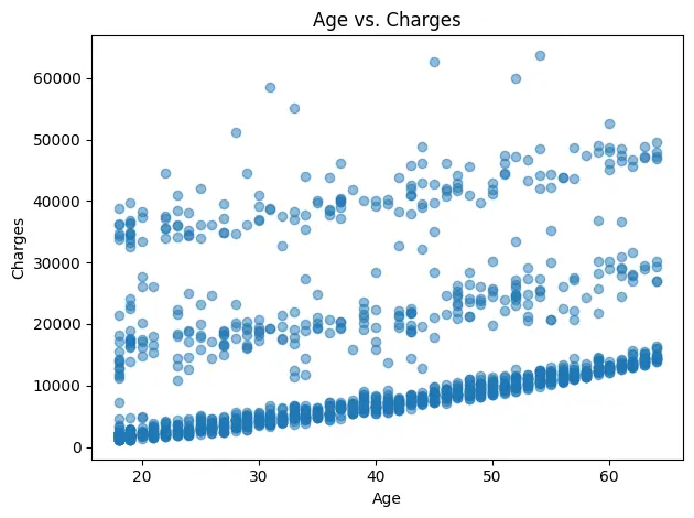
In this example, we will use Matplotlib to visualize the Medical Insurance Cost dataset. We will start with a histogram showing the distribution of medical charges, and then create a scatter plot to explore the relationship between age and charges.
# pip install matplotlib
import matplotlib.pyplot as plt
import pandas as pd

df = pd.read_csv(f"{dataset_path}/insurance.csv")

# Histogram: distribution of charges
plt.figure()
df["charges"].plot(kind="hist", bins=30)
plt.title("Distribution of Medical Charges")
plt.xlabel("Charges")
plt.ylabel("Count")
plt.tight_layout()
plt.show()


# Scatter: age vs charges
plt.figure()
plt.scatter(df["age"], df["charges"], alpha=0.5)
plt.title("Age vs. Charges")
plt.xlabel("Age")
plt.ylabel("Charges")
plt.tight_layout()
plt.show()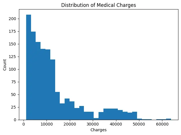
7. Seaborn
Seaborn is a high-level data visualization library built on top of Matplotlib, designed for creating statistically rich, aesthetically appealing charts with minimal code. It's widely used for exploratory data analysis (EDA) and statistical storytelling, allowing analysts to visualize relationships, distributions, and patterns effortlessly.
Seaborn use cases:
- Exploratory visualization: Quickly uncover trends, correlations, and outliers using built-in statistical plots.
- Distribution analysis: Visualize histograms, KDE plots, and boxplots to understand data spread and skew.
- Categorical comparisons: Compare groups or segments using bar plots, violin plots, or swarm plots.
- Correlation and pair analysis: Use heatmaps and pair plots to explore relationships between multiple variables.
- Enhanced aesthetics: Apply Seaborn's themes and color palettes for cleaner, publication-ready visuals.
Seaborn code example:
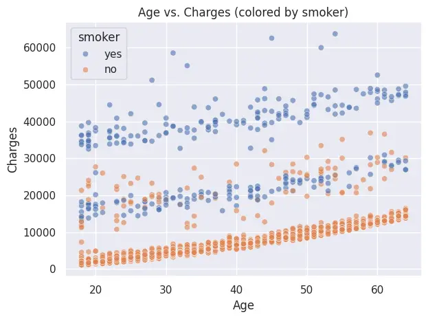
In this example, we will use Seaborn to visualize the Medical Insurance Cost dataset. We will first plot a histogram with a kernel density estimate (KDE) to show the distribution of medical charges, and then create a scatter plot highlighting how smoker status affects the relationship between age and charges.
# pip install seaborn
import pandas as pd
import seaborn as sns
import matplotlib.pyplot as plt

# Load
df = pd.read_csv(f"{dataset_path}/insurance.csv")

sns.set_theme()  # simple default theme

# 1) Histogram with KDE: distribution of charges
plt.figure()
sns.histplot(df["charges"], bins=30, kde=True)
plt.title("Distribution of Medical Charges")
plt.xlabel("Charges")
plt.ylabel("Count")
plt.tight_layout()
plt.show()

# 2) Scatter: age vs charges, colored by smoker
plt.figure()
sns.scatterplot(data=df, x="age", y="charges", hue="smoker", alpha=0.6)
plt.title("Age vs. Charges (colored by smoker)")
plt.xlabel("Age")
plt.ylabel("Charges")
plt.tight_layout()
plt.show()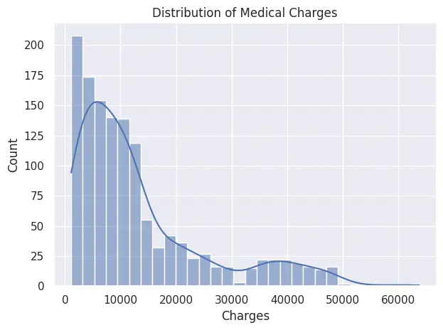
8. Plotly
Plotly is Python's go-to library for interactive data visualization. Unlike Matplotlib and Seaborn, which produce static images, Plotly generates charts that users can hover over, zoom into, and filter directly in the browser. The high-level plotly.express API mirrors Seaborn's simplicity while adding built-in interactivity, making it the natural choice when your audience needs to explore the data themselves rather than just view it.
Plotly use cases:
- Client-facing reports: deliver charts with hover details and drill-down capability that clients can interact with without analyst support.
- Executive dashboards: present KPIs with period-over-period overlays and toggleable legend entries.
- Web-based analytics: embed charts in Streamlit apps, Dash dashboards, or export to standalone HTML.
- Geospatial analysis: create choropleth maps and bubble maps directly from DataFrames using
plotly.express.choropleth. - Side-by-side comparisons: overlay multiple data series in a single interactive chart with zero JavaScript.
Plotly code example:
In this example, we use plotly.express to create an interactive scatter plot of the Medical Insurance Cost dataset, coloring points by smoker status so the cost pattern is immediately visible on hover.
# pip install plotly
import plotly.express as px
import pandas as pd

df = pd.read_csv(f"{dataset_path}/insurance.csv")

fig = px.scatter(
    df,
    x="age",
    y="charges",
    color="smoker",
    size="bmi",
    hover_data=["region", "children"],
    title="Age vs. medical charges by smoker status",
    labels={"charges": "Medical charges ($)", "age": "Age"},
)

fig.show()
Unlike the Matplotlib scatter we built earlier, this chart lets you hover individual points to see region, children count, and exact charges. Click the legend entries to isolate smokers or non-smokers, zoom into specific age brackets, or export the chart directly from the toolbar.
Machine learning Python tools
Machine learning has become an integral part of data analysis jobs. Professionals in this field are expected to provide predictive analysis and forecast numbers effectively. Solid machine learning data prep — cleaning, normalizing, and structuring raw inputs — lays the groundwork for every model you build. In this section, we will learn about essential Python libraries for data science machine learning, covering both simple frameworks for general tasks and deep learning frameworks for working with more complex models.
9. Scikit-learn
Scikit-learn (sklearn) is Python's most widely used library for machine learning and predictive analytics. It offers a simple, consistent API for building models, preprocessing data, and evaluating performance, covering everything from regression and classification to clustering, feature selection, and model validation. Its clean design makes it perfect for both beginners and production-level pipelines.
Scikit-learn use cases:
- Predictive modeling: Build classification, regression, or clustering models with minimal code.
- Data preprocessing: Scale, normalize, and encode data using transformers and pipelines.
- Model evaluation: Compute accuracy, precision, recall, F1-score, and ROC curves.
- Pipeline automation: Chain preprocessing and modeling steps for cleaner, reproducible workflows.
- Feature selection & dimensionality reduction: Use PCA, feature importance, or correlation filters to simplify models.
Scikit-learn code example:
In this example, we will train a simple binary classification model using Scikit-learn's built-in Breast Cancer dataset. We will build a pipeline that scales the data using StandardScaler, fits a Logistic Regression model, and evaluates its accuracy on a test set.
# pip install scikit-learn
from sklearn.datasets import load_breast_cancer
from sklearn.model_selection import train_test_split
from sklearn.pipeline import make_pipeline
from sklearn.preprocessing import StandardScaler
from sklearn.linear_model import LogisticRegression
from sklearn.metrics import accuracy_score

# 1) Load sample dataset (binary classification)
X, y = load_breast_cancer(return_X_y=True, as_frame=True)

# 2) Train/test split
X_train, X_test, y_train, y_test = train_test_split(
    X, y, test_size=0.2, stratify=y, random_state=42
)

# 3) Pipeline: scale → logistic regression
pipe = make_pipeline(StandardScaler(), LogisticRegression(max_iter=1000))
pipe.fit(X_train, y_train)

# 4) Evaluate
print("Test accuracy:", accuracy_score(y_test, pipe.predict(X_test)))
Output:
The Logistic Regression model achieved a 98.2% accuracy on the test set, demonstrating strong predictive performance with minimal tuning.
Test accuracy: 0.9824561403508771This workflow highlights how Scikit-learn's pipeline architecture makes it effortless to combine preprocessing and modeling steps into a single, reusable structure.
10. PyTorch
PyTorch is a flexible, Pythonic deep learning framework for building, training, and deploying neural networks. It supports dynamic computation graphs, GPU acceleration, and a rich ecosystem of tools like torchvision, torchaudio, and torchtext, making it ideal for AI research, computer vision, and language modeling.
For data analysts, PyTorch extends beyond traditional machine learning, enabling them to build deep learning models for advanced predictive analytics, perform representation learning, and explore unstructured data like images, audio, and text.
PyTorch use cases:
- Predictive analytics for KPIs: Build deep learning models to forecast metrics like revenue, churn, or customer lifetime value.
- Time-series forecasting: Use LSTMs or Transformers to predict trends in sales, demand, or performance data.
- Anomaly detection: Detects unusual patterns in business metrics or transactions using autoencoders.
- Customer segmentation: Generate embeddings to group customers by behavior or engagement patterns.
- Feature extraction: Use pretrained models to extract insights from images, audio, or text for data enrichment.
PyTorch code example:
In this example, we fine-tune a pretrained ResNet-18 model on the CIFAR-10 dataset (10 image classes). The code demonstrates loading data, modifying the final layer for classification, training for a few epochs, and evaluating accuracy on the test set.
# pip install torch torchvision

import torch
from torch import nn
from torch.utils.data import DataLoader
from torchvision.datasets import CIFAR10
from torchvision.models import resnet18, ResNet18_Weights
from torchvision import transforms

# 1) Device
device = torch.device("cuda" if torch.cuda.is_available() else "cpu")

# 2) Data: CIFAR-10 (10 classes)
weights = ResNet18_Weights.DEFAULT
preprocess = weights.transforms()  # includes resize to 224, tensor, normalization

train_ds = CIFAR10(root="data", train=True,  download=True, transform=preprocess)
test_ds  = CIFAR10(root="data", train=False, download=True, transform=preprocess)

train_loader = DataLoader(train_ds, batch_size=64, shuffle=True,  num_workers=2)
test_loader  = DataLoader(test_ds,  batch_size=256, shuffle=False, num_workers=2)

# 3) Model: ResNet-18 (pretrained), replace final layer
num_classes = 10
model = resnet18(weights=weights)
model.fc = nn.Linear(model.fc.in_features, num_classes)
model = model.to(device)

# 4) Train setup
criterion = nn.CrossEntropyLoss()
optimizer = torch.optim.Adam(model.parameters(), lr=1e-3)

# 5) Train (few epochs to keep it short)
for epoch in range(3):
    model.train()
    running_loss, correct, total = 0.0, 0, 0
    for xb, yb in train_loader:
        xb, yb = xb.to(device), yb.to(device)
        optimizer.zero_grad()
        out = model(xb)
        loss = criterion(out, yb)
        loss.backward()
        optimizer.step()

        running_loss += loss.item() * xb.size(0)
        correct += (out.argmax(1) == yb).sum().item()
        total += yb.size(0)

    print(f"Epoch {epoch+1}: loss={running_loss/total:.4f}, acc={correct/total:.3f}")

# 6) Evaluate
model.eval()
correct, total = 0, 0
with torch.no_grad():
    for xb, yb in test_loader:
        xb, yb = xb.to(device), yb.to(device)
        preds = model(xb).argmax(1)
        correct += (preds == yb).sum().item()
        total += yb.size(0)

print("Test accuracy:", correct / total)
Output:
After just three epochs, the fine-tuned ResNet-18 achieves around 92% training accuracy and ~88% test accuracy. This demonstrates how transfer learning allows data analysts to build high-performing computer vision models without massive datasets or long training times.
Downloading: "https://download.pytorch.org/models/resnet18-f37072fd.pth" to /root/.cache/torch/hub/checkpoints/resnet18-f37072fd.pth

100.0%

Epoch 1: loss=0.5975, acc=0.796
Epoch 2: loss=0.3437, acc=0.883
Epoch 3: loss=0.2368, acc=0.920
Test accuracy: 0.8791
Interactive dashboard Python tools
This is the final stage of the data analysis project. The goal is to present the data to non-technical stakeholders in a way that is easy to understand. One effective method is to create an interactive dashboard. This allows stakeholders to explore key metrics, filter by time or segment, and dive into the financials using plain language. This approach makes it easier to grasp what is really happening in the business.
11. Streamlit
Streamlit turns Python scripts into interactive data apps, perfect for analysts who want to share EDA, KPIs, and models without front-end work. It ships with native chart elements, layout primitives, caching, and easy file download support, so you can go from notebook logic to a polished dashboard in minutes. Paired with Firecrawl, it is also an effective tool for web research pipelines that surface synthesized findings in a clean, shareable UI.
Streamlit use cases:
- Self-serve EDA portals: Launch the apps so stakeholders explore distributions, segments, and cohorts without analyst hand-holding; log usage to prioritize your analytics roadmap.
- KPI & executive dashboards: Build interactive, drill-down dashboards with period comparisons, targets, and alerts; enable CSV/XLSX export for finance and ops.
- ML demos with interactive UI: Wrap trained models behind clear controls (sliders, selectors) so users can run scenarios, compare outcomes, and understand model behavior.
- Data quality & governance monitors: Automate schema validation, null/outlier checks, distribution drift, and freshness SLAs; surface exceptions with run logs and audit trails.
- Automated reporting & insights: Parameterize recurring reports, render charts/tables, annotate key changes, and offer one-click downloads or scheduled email delivery.
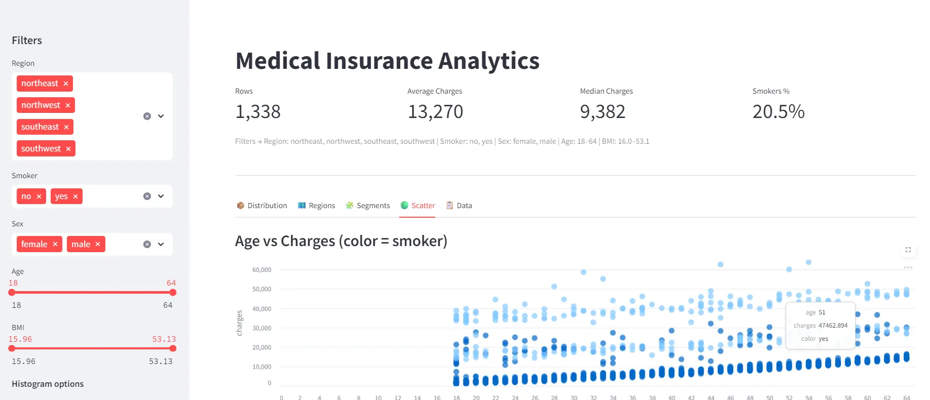
Streamlit code example:
This app fetches the Medical Insurance Cost dataset via KaggleHub and presents it in an interactive Streamlit dashboard. It includes sidebar filters for slicing the data, KPI cards for at-a-glance metrics, and native interactive charts for exploring distributions, regional trends, segments, and relationships, all in a clean, responsive UI.
Here are the details:
- Imports & setup: Loads Streamlit, Pandas, NumPy, and KaggleHub, then configures the app layout and title for a polished dashboard experience.
- Data loading: Uses
@st.cache_datato fetch and cache the Medical Insurance Cost dataset from KaggleHub and clean categorical fields for consistent filtering. - Sidebar filters: Adds interactive widgets (multiselects, sliders, toggles) that let users filter data by region, smoker status, gender, age, and BMI in real time.
- Filtered dataset: Builds a Boolean mask to subset the DataFrame based on all sidebar selections, creating a dynamic, user-controlled view of the data.
- KPI cards: Displays top-level summary metrics, row count, average/median charges, and smoker percentage, in responsive column-based cards.
- Interactive tabs: Organizes visuals into tabs for distribution, regional comparisons, demographic segments, scatter relationships, and raw data exploration.
- Data export: Lets users download the filtered data as CSV.
# app.py
# pip install streamlit pandas kagglehub
import numpy as np
import pandas as pd
import streamlit as st
import kagglehub

st.set_page_config(page_title="Medical Insurance Analytics", layout="wide", page_icon="📊")

@st.cache_data
def load_data():
    path = kagglehub.dataset_download("mosapabdelghany/medical-insurance-cost-dataset")
    df = pd.read_csv(f"{path}/insurance.csv")
    for c in ["sex", "smoker", "region"]:
        df[c] = df[c].astype(str).str.lower().str.strip()
    return df

df = load_data()

# ============ SIDEBAR ============ #
with st.sidebar:
    st.header("Filters")
    regions = st.multiselect("Region", sorted(df["region"].unique()), default=sorted(df["region"].unique()))
    smokers = st.multiselect("Smoker", sorted(df["smoker"].unique()), default=sorted(df["smoker"].unique()))
    sexes   = st.multiselect("Sex",    sorted(df["sex"].unique()),    default=sorted(df["sex"].unique()))
    age_range = st.slider("Age", int(df.age.min()), int(df.age.max()),
                          (int(df.age.min()), int(df.age.max())))
    bmi_range = st.slider("BMI", float(df.bmi.min()), float(df.bmi.max()),
                          (float(df.bmi.min()), float(df.bmi.max())))
    # Histogram controls
    st.markdown("**Histogram options**")
    bins = st.slider("Bins", 10, 60, 40, step=5)
    use_log = st.toggle("Log scale", value=False)

mask = (
    df.region.isin(regions)
    & df.smoker.isin(smokers)
    & df.sex.isin(sexes)
    & df.age.between(*age_range)
    & df.bmi.between(*bmi_range)
)
dff = df.loc[mask].copy()

# ============ HEADER + KPI CARDS ============ #
st.title("Medical Insurance Analytics")

k1, k2, k3, k4 = st.columns(4)
k1.metric("Rows", f"{len(dff):,}")
k2.metric("Average Charges", f"{dff['charges'].mean():,.0f}")
k3.metric("Median Charges", f"{dff['charges'].median():,.0f}")
k4.metric("Smokers %", f"{(dff['smoker'].eq('yes').mean() * 100):.1f}%")

st.caption(
    f"Filters → Region: {', '.join(regions)} | Smoker: {', '.join(smokers)} | Sex: {', '.join(sexes)} "
    f"| Age: {age_range[0]}-{age_range[1]} | BMI: {bmi_range[0]:.1f}-{bmi_range[1]:.1f}"
)

st.divider()

# ============ TABS ============ #
tab1, tab2, tab3, tab4, tab5 = st.tabs(
    ["📦 Distribution", "🗺️ Regions", "🧩 Segments", "🟢 Scatter", "📋 Data"]
)

# ---- Distribution (native bar_chart with real histogram bins) ---- #
with tab1:
    counts, edges = np.histogram(dff["charges"], bins=bins)
    mids = (edges[:-1] + edges[1:]) / 2
    hist_df = pd.DataFrame({"bin_mid": mids, "count": counts})
    st.subheader("Distribution of Charges")
    st.bar_chart(hist_df, x="bin_mid", y="count", use_container_width=True)
    if use_log:
        # Simple note: st.bar_chart doesn't expose direct log axis; show hint
        st.caption("Tip: For log-scale inspection, narrow your filters or increase bins.")

# ---- Regions ---- #
with tab2:
    st.subheader("Average Charges by Region")
    reg = dff.groupby("region", as_index=False)["charges"].mean().sort_values("charges", ascending=False)
    st.bar_chart(reg, x="region", y="charges", use_container_width=True)

    c1, c2 = st.columns(2)
    with c1:
        st.subheader("Count by Region")
        cnt = dff["region"].value_counts().rename_axis("region").reset_index(name="count")
        st.bar_chart(cnt, x="region", y="count", use_container_width=True)
    with c2:
        st.subheader("Average BMI by Region")
        bmi_reg = dff.groupby("region", as_index=False)["bmi"].mean()
        st.bar_chart(bmi_reg, x="region", y="bmi", use_container_width=True)

# ---- Segments ---- #
with tab3:
    st.subheader("Average Charges by Smoker & Sex")
    seg = dff.groupby(["smoker", "sex"], as_index=False)["charges"].mean().sort_values("charges", ascending=False)
    # two simple bars for clarity
    left, right = st.columns(2)
    with left:
        st.bar_chart(seg[seg["sex"] == "male"], x="smoker", y="charges", use_container_width=True)
        st.caption("Male")
    with right:
        st.bar_chart(seg[seg["sex"] == "female"], x="smoker", y="charges", use_container_width=True)
        st.caption("Female")

# ---- Scatter (native scatter_chart) ---- #
with tab4:
    st.subheader("Age vs Charges (color = smoker)")
    # Streamlit scatter_chart supports color/size columns
    scat_df = dff[["age", "charges", "smoker"]].rename(columns={"smoker": "color"})
    st.scatter_chart(data=scat_df, x="age", y="charges", color="color", use_container_width=True)

# ---- Data ---- #
with tab5:
    st.subheader("Top Charges (filtered)")
    st.dataframe(dff.sort_values("charges", ascending=False).head(25), use_container_width=True)
    st.download_button(
        "Download filtered CSV",
        data=dff.to_csv(index=False).encode("utf-8"),
        file_name="filtered_insurance.csv",
        mime="text/csv",
    )

#Run: streamlit run app.py  •  To use port 8080:  --server.port 8080
The dashboard provides an interactive view of the Medical Insurance Cost dataset, with sidebar filters, KPI cards, and visual tabs for exploring distributions, regions, segments, and scatter relationships. It allows users to quickly uncover insights such as the impact of age, region, and smoker status on medical charges.
Quick-reference comparison
| Library | Category | Key strength | Best for |
|---|---|---|---|
| Firecrawl | Data extraction | AI-ready web data collection | Collecting fresh data from websites and APIs |
| KaggleHub | Data extraction | Versioned dataset access | Loading public benchmark datasets into notebooks |
| NumPy | Data analysis | Vectorized numerical operations | Math-heavy EDA, feature engineering, and KPI calculations |
| Pandas | Data analysis | Tabular data manipulation | Cleaning, grouping, reshaping, and analyzing datasets |
| SQLAlchemy | Data analysis | Database connectivity | Querying production databases from Python |
| Matplotlib | Visualization | Full visual control | Custom, publication-ready static charts |
| Seaborn | Visualization | Statistical aesthetics | Distribution, correlation, and categorical analysis |
| Plotly | Visualization | Built-in interactivity | Client reports, interactive dashboards, and HTML exports |
| Scikit-learn | Machine learning | Consistent pipeline API | Regression, classification, clustering, and preprocessing |
| PyTorch | Machine learning | Flexible deep learning | Forecasting, anomaly detection, and image or text tasks |
| Streamlit | Dashboards | Rapid app deployment | Sharing analyses as shareable interactive web apps |
Honorable mentions: Polars (Pandas alternative for large datasets), DuckDB (fast SQL on local files), SciPy (statistical testing and hypothesis testing), and openpyxl (Excel file automation and formatting).
Go forth and analyze
Python provides data analysts with a powerful toolkit for smoothly transitioning from raw data to meaningful insights. Whether you are collecting data from APIs, cleaning large datasets, building visual dashboards, or applying machine learning for predictions, these eleven data science Python libraries are the best for modern analytics workflows:
- Firecrawl: search, scrape, and crawl the web to collect fresh context and datasets
- KaggleHub: download public datasets programmatically from Kaggle
- NumPy: fast arrays, linear algebra, and numerical routines
- Pandas: data loading, cleaning, transformation, and analysis
- SQLAlchemy: connect to databases and query with SQL (or ORM)
- Matplotlib: highly customizable plotting foundation
- Seaborn: quick, beautiful statistical visualizations
- Plotly: interactive charts and dashboards you can embed or share
- Scikit-learn: data preprocessing and general model training and evaluation
- PyTorch: deep learning for advanced modeling needs
- Streamlit: turn analyses into interactive apps and dashboards
Recommended learning path: start with Pandas and NumPy for data manipulation. Add Matplotlib or Seaborn for visualization, then Plotly when you need interactive charts for reports. Once comfortable, add SQLAlchemy for database work and Scikit-learn for predictive modeling. Use Firecrawl whenever you need to collect data from the web, and Streamlit to share your finished analyses as web apps. For hands-on practice, Python projects covering beginner to advanced skill levels are a great way to apply these libraries in real-world scenarios.
You can get started with Firecrawl by signing up for a free account here.
Frequently Asked Questions
What is Firecrawl and what makes it useful for data analysts?
Firecrawl is the context API to search, scrape, and interact with the web at scale, converting websites into clean Markdown or structured JSON. Data analysts use it to collect datasets from live web pages, track competitor pricing, gather product reviews for sentiment analysis, and build ETL pipelines that pull from public sites into a data warehouse.
Do I need to build a custom spider or crawler to use Firecrawl?
No. Firecrawl handles crawling, JavaScript rendering, and output formatting for you. You pass a URL and the desired format to the Python SDK, and Firecrawl returns clean, structured data — no custom spider logic required.
What is the difference between Pandas and NumPy for data analysis?
NumPy operates on raw numerical arrays and is optimized for fast mathematical computations like matrix operations, statistical summaries, and vectorized transformations. Pandas builds on NumPy and adds labeled DataFrame and Series structures for tabular data, making it better suited to data cleaning, grouping, joining, and time-series work.
How do I connect a Pandas DataFrame to a SQL database?
Use SQLAlchemy to create a database engine and then call Pandas pd.read_sql() to query data directly into a DataFrame, or df.to_sql() to write a DataFrame back to the database. This combination lets you run aggregations in the database where they are most efficient and load only the results into memory.
What are the main differences between Matplotlib and Seaborn for data visualization?
Matplotlib is the foundational Python visualization library that gives you full control over every chart element. Seaborn is built on top of Matplotlib and provides a higher-level interface with built-in statistical chart types, cleaner default styles, and less boilerplate for common EDA tasks like distribution plots and categorical comparisons.
When should I use Scikit-learn versus PyTorch for a machine learning project?
Use Scikit-learn for traditional machine learning tasks such as regression, classification, clustering, and preprocessing pipelines, especially with structured tabular data. Use PyTorch when you need deep learning models for unstructured data like images, text, or time series, or when you require GPU acceleration and custom neural network architectures.
How do I download a Kaggle dataset programmatically in Python?
Install KaggleHub with pip, then call kagglehub.dataset_download() with the dataset identifier. For public datasets, no API key is required. The dataset is cached locally, so subsequent calls return the cached version without re-downloading. You can then load CSV files with Pandas using the returned file path.
How do I build and share an interactive data dashboard without front-end experience?
Streamlit lets you turn a Python script into an interactive web application using components like st.bar_chart(), st.slider(), and st.dataframe(). Run the app locally with streamlit run app.py and share it by deploying to Streamlit Community Cloud. No HTML, CSS, or JavaScript knowledge is required.
What Python library should a beginner data analyst learn first?
Start with Pandas for loading, cleaning, and exploring tabular datasets — it covers the majority of everyday data analyst tasks. Once comfortable with Pandas, add Matplotlib or Seaborn for visualization, then Scikit-learn for basic machine learning. Firecrawl is a good early addition if you need to collect data from the web.
How does KaggleHub differ from downloading a dataset manually from Kaggle?
KaggleHub lets you fetch datasets directly inside a Python script using a single API call, with automatic local caching and version tracking. This means you can integrate dataset downloads into a reproducible pipeline and always pull the latest version without manually visiting the Kaggle website.
What is Plotly and how is it different from Matplotlib and Seaborn?
Plotly produces interactive charts that users can hover over, zoom into, and filter directly in the browser — unlike Matplotlib and Seaborn, which generate static images. Plotly Express provides a high-level API similar to Seaborn, but the output is shareable as HTML and embeds naturally in Streamlit dashboards and web reports.
When should I use Polars instead of Pandas?
Polars is worth switching to when datasets exceed available memory or Pandas operations are too slow. Written in Rust on Apache Arrow, Polars uses parallel execution and lazy query optimization to process data faster than Pandas on large-scale transformations. For most business datasets that fit comfortably in memory, Pandas remains the more widely supported choice.
What is DuckDB and when would I use it over SQLAlchemy?
DuckDB is an in-process analytical database that runs SQL queries directly on local CSV, Parquet, and JSON files without a database server. SQLAlchemy is better for connecting to production databases like PostgreSQL or MySQL. Use DuckDB when you want fast SQL analytics on local files, and SQLAlchemy when you need to connect to an existing database.